dotz

002
Project details
BRAND
Dotz
YEAR
2023
PROJECT GOAL
Reduce friction on the onboarding, to new and old customers that wants to enter in the app. Making it easier and faster.
ROLE
I was the product designer responsible for acting in those projects, mapping decisions and needs, designing them and delivering it to handoff.

from a wall blocker to a river that brought new customers to app.

HOW THE NEED WAS FOUND?
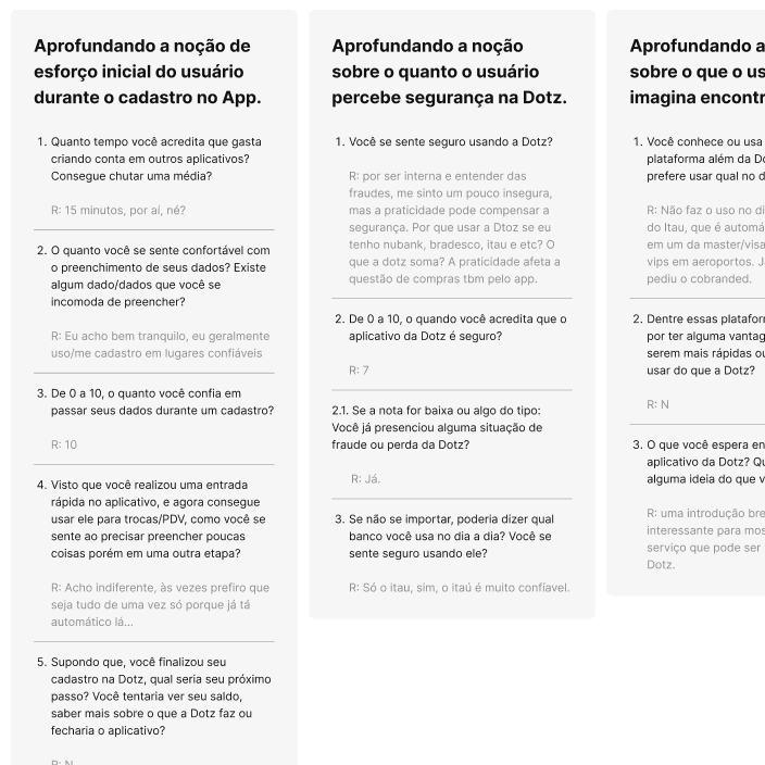
When we talk about onboarding, we can resume it in two words: Exhaustive and Complex. It resume most of all onboardings nowadays, also it could be applied to Dotz onboarding. Too many security validations and steps, so, for our costumer, it was very tough to come to app.

So, we find a real need to evolve and change our results that came from our old onboarding. Considering that we used to lead user to create a Loyalty account and a Digital wallet account to enter in app.

From a deep mapping to design the strategy that will solve our problem.

IS IT THAT WILL SOLVE?
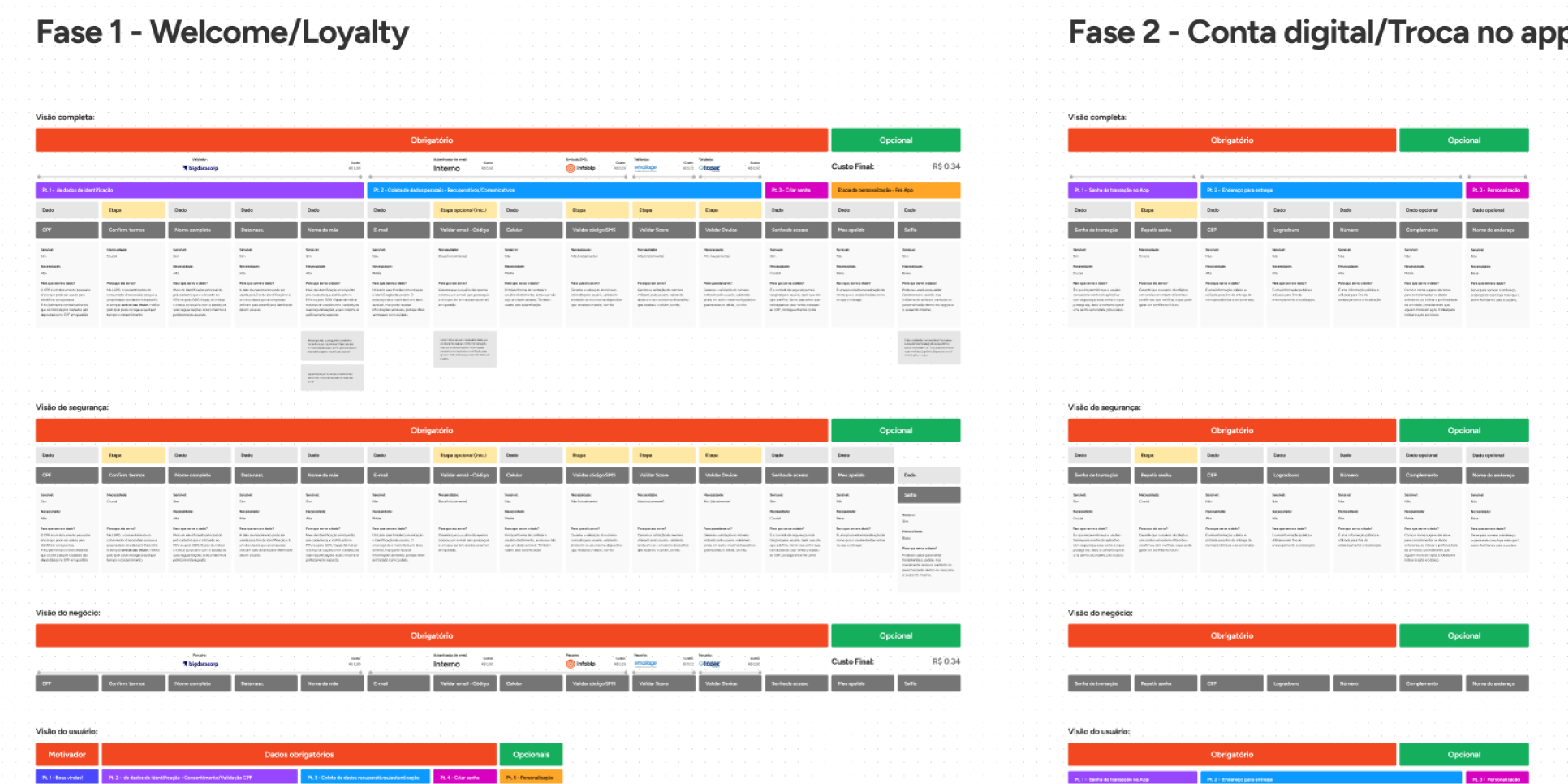
So, considering that our business is focused on Loyalty and points mechanics, and our fintech arm still growing, we considered to remove this need of creating both accounts to start using the app, since it has a high cost for us, because we need to validate user, documents and etc.
If the user just use the Loyalty, it still easier to introduce him on app, and in next step, we show the advantages of Digital wallet account.

now it's time to design, considering security, costs and a better experience inside it.

IS IT THE BETTER WAY?
After the research, the mapping and everything that we did to understand user and business needs, it's time to design, or as we get used to listen: create screens :). Technically we're talking about click reduction, screen read, content and security steps, how to turn it into a great experience? Well, i don't have the magic answer, but i've designed it below.

WHAT KIND OF TROUBLE and success WE FOUND DURING THIS JOURNEY?

IT HAS A HAPPY ENDING?
Since we've kicked off this project, delivery time and tech limitations were against us, so, design with all that other things and those limitations was a great challenge! We've had 2 months to put this project to delivery, and also a legacy tech that has defined some visual that we applied, so, against all those barriers, we've got a great result. Metrics will say it better.

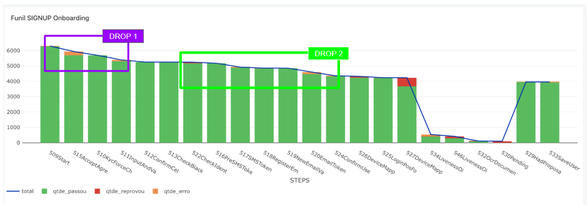
After implemented the new onboarding structure, considering the previous research, we jumped from 32% of conversion success to 64%, and now it has less friction considering that we had 40 screens and now we have 12, and data that we collect are aligned with LGPD.

Also next steps are understand deep both drops in image below, and how to fix it.